 This is my second rainbow project. I decided to do hummingbirds and put stained glass behind them. There isn't exactly a rainbow but the colors are close. It was interesting to see which hummingbirds looked better when the stained glass was put behind the. I used a filter for the lily because I didn't want to loose its coloring.
Friday, May 20, 2011
The Stain-glassed Hummingbirds
 This is my second rainbow project. I decided to do hummingbirds and put stained glass behind them. There isn't exactly a rainbow but the colors are close. It was interesting to see which hummingbirds looked better when the stained glass was put behind the. I used a filter for the lily because I didn't want to loose its coloring.
The Rainbow Swan Lake
 This is my version of Swan Lake. The swans morph into ballerinas from left to right. I was inspired by the silhouettes of dancers that I found online. I kept the big swan black because I wanted it to be a focal point. It also represents one of the transformation stages...the main one. It took me a while to figure out what I was going to do, but once I figured it out everything was pretty easy.
Thursday, May 12, 2011
Ice Trays For Sale!
Monday, May 9, 2011
Julia Barello
The Covered Girl
 This is my version of the Christina Aguilera album cover. What I did is I found interesting album covers and arranged a sort of collage on one side of my face. There are so many amazing album covers that I tried to find the best and utilize their best features. I picked to have the Bruno Mars cover as my background because it has always been one of my favorite album covers to look at. My face is covered with album covers... :) I have always loved making collages in photoshop more than cutting up magazines and gluing the pictures down. This is one of my favorite assignments that we have done because I was able to do one of my favorite things. I was inspired by Christina's album and Bruno Mars's.
 Wednesday, April 13, 2011
Chairs and Shadows
 For this project I decided to post two of the chairs I did. The fist one has a picture of paper lanterns shaped like stars. On the bottom cushion I used the colors from the picture strips to splatter paint the legs and cushion. I left the pattern of the cushion showing but not too much. For my second one I chose Van Gogh. This chair was more fun to create. The shadow is supposed to look like the sunlight is shinning on the chair and there is a wall behind it. I really like how i made all of the painting strips blend. I chose a different painting for the bottom of the chair because I felt it was too much blue to do the whole chair Starry Night like. This was an interesting project and was fun when it all came together.
Thursday, March 31, 2011
Winter and Spring......Midterm Exam!
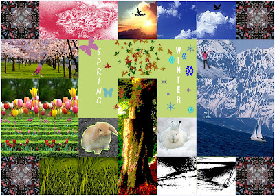 This is our midterm exam! I used every tool that I was supposed to use and more! I really wanted to focus on spring and winter. My favorite part of this is the mountain scene with the boat. It fit together really well. It took me a while to start but once I started I couldn't stop messing with it. I enjoyed this midterm.
Tuesday, March 29, 2011
Krazyy Kool Kaleidoscope
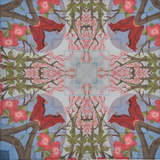
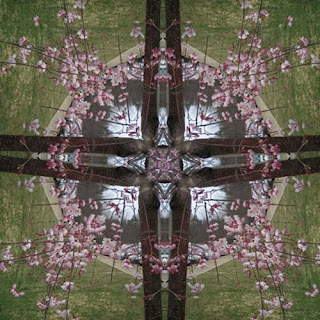
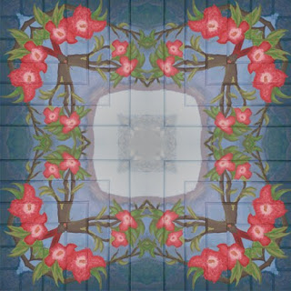
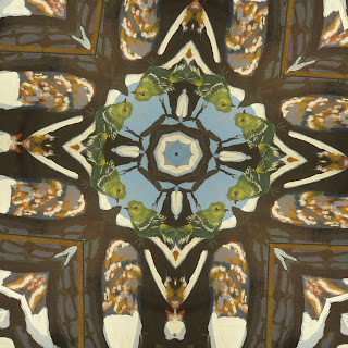
For this mini project we learned how to make kaleidoscope images with just a triangle of one image. I think my two favorites are the one of the green bird and the one tree with pink flowers. It was a real tree that I took a picture of. I thought at first that because of the lines on the murals that it would look weird once I put everything together...but it actually made it better because it added more depth. The green bird makes me smile.....I am always inspired by nature and how colorful it is. The picture with the real trees look almost like a portal. I was nervous when I decided to crop that photo and make it a kaleidoscope image. When you start off the image looks really weird but as the pieces fit together it turns out great! This was a really fun project to do.
Friday, March 25, 2011
Spring has Sprung
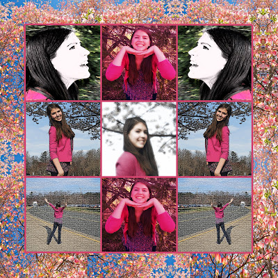 For this project we were told to do a 9x9 canvas and use self portraits to fill the squares. My outfit was very spring like and the tree outside had blossomed with flowers. Spring was my inspiration! I also used different filters to change the image. I used the tile tool and lots more that I can't remember off the top of my head. This project was all about experimenting and getting to know the filters. I created the background by taking a picture of dogwood flowers and duplicating it multiple times. I used a lot of symmetry and a strong center so that there is a focal point but then your eyes move to a different direction.
Monday, March 21, 2011
Pixlr.com (a.k.a Free Photoshop)
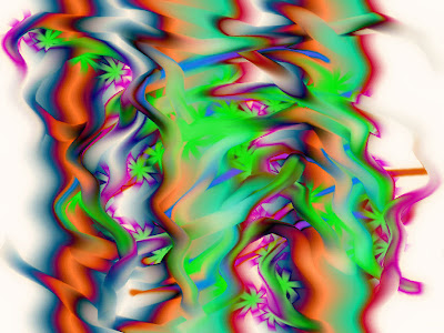
For my photo editing site I did pixlr.com. This site offers everything that photoshop does but not as in depth. It wasn't very cool because it was photoshop but some of the controls didn't do or change like photoshops application. It was easy to use because all the tool bar buttons were the same. Someone who might use it is someone that wants to use photoshop but doesn't have the money to buy photoshop. This would be a good application if someone was at home and they wanted to fix up something or play around with a photo. I mostly did abstract things when using it. This is what I came up with...I really like the applications filters.
Wednesday, March 16, 2011
Four-Square...Watch Out for the Train!
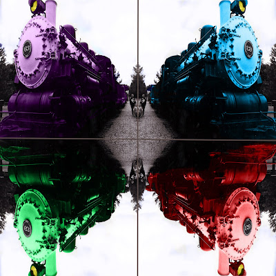 For my second four-square picture I decided to do something simpler than my pandas. I scanned a train picture that I took for my photography class and used the color replacement tool to color the train different colors. I added a pop of color with the light so that it wasn't just a blue, green, red, and purple train. I also left the numbers on the train black and white because it needed something on the train that wasn't colorful. I was inspired by the look of the train and the little girl and her mom running to the front to become a conductor for a minute. This is all me...because its my picture and my digital imaging transformation. I am very proud at how it turned out and how different it is from the pandas.
Lets Play Four-Square!
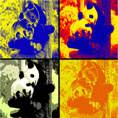 For this project Four-Square was the game. I decided to do two different four square pictures. The first one is of two pandas which inspired me by their adorableness. I really played around with the filters and the gradient map. I really like how my pandas turned out. You can still tell what it is, but each panda uniquely different. I love pandas and so this was really fun to manipulate a picture with pandas like this. Four-Square was one of my favorite games at camp and now I like it even more!
Silhouette of Amazing Things
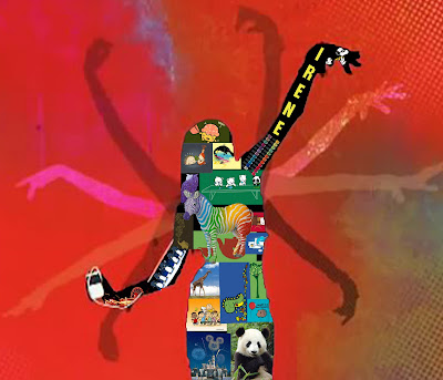 This is the second part to our silhouette project. I needed to take a silhouette of myself and fill it with things that I like. I didn't have time to take one of myself but I remembered that there was an itunes photo I stumbled across a while ago. I thought that the girl looked like me and so I decided to use it. I filled it with these funny and artistic shirts that I found on shirt.woot.com and some other random images that I found interesting. This was a fun project because I like working on collage type projects. I was inspired by previous collages that I have done in photoshop.
Wednesday, March 9, 2011
That's Punny
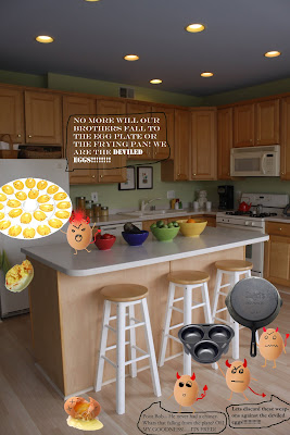
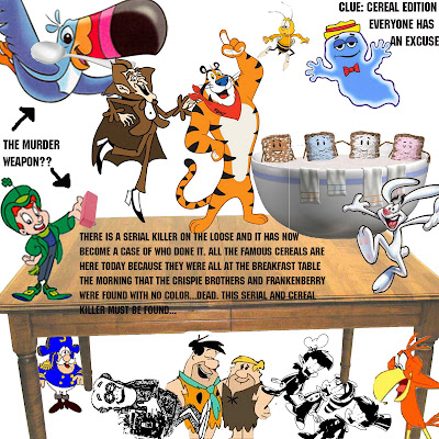
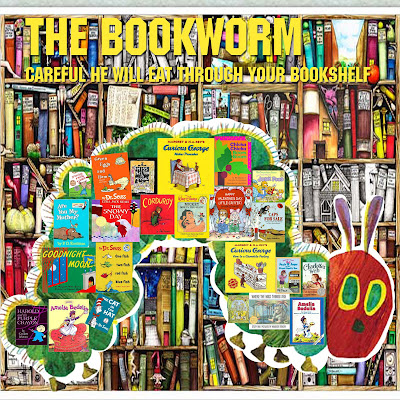
For this project we had to do four visual puns. I chose to do (from the top) deviled eggs, serial killer, Dr. Pepper, and bookworm. I was inspired for the deviled eggs by eggs mad about the things used to cook eggs. The eggs are rebelling around the kitchen. This was the first visual pun I did. I think it turned out great. My only problem is that you cant see the egg's legs that are on the floor very well. I also used the posterize on the egg plate...which I didn't even know was a thing. It added depth and a really cool looking plate.
My second visual pun was the serial killer...which translated to cereal killer. This might not make sense to some until they look at it a bit longer. I took all the major cereal mascots and put them on or below the table where The Crispie Brothers and Frankenberry were murdered. I was inspired by Clue. I wish my canvas size could have been larger but I think I did a good job fitting everything I wanted to fit in there. My Clue has a lot more options though because there are more characters than the board game. While there are only two murder weapons all the characters have an even chance to be the murderer. I used the threshold technique on Frankenberry and the Crispie Brothers to show that they were murdered by loosing their color.
My next pun is Dr. Pepper, which as everyone knows is a soda. I made the pepper a doctor! I added a bit of humor if you know anything about peppers because the habanero pepper is known to be the hottest pepper around...and he feels hot...get it? Anyway the jalapeno pepper feels like he is going to get chopped up and put in salsa...because thats what usually happens. I used the gradient tool for the little peppers on the side of his family practice sign. I also used the overlay on the paintings of the peppers on his wall. It says la pimienta, which in spanish means pepper. I really like this one.
For my last pun I decided to do a bookworm. I was inspired by all of the books that I used to read as a child. So I went to Barnes & Noble and looked up almost ALL the books that were my favorites. I REALLY like this one because it made me look back and remember all the books that I read. I found a really cool bookcase and at first it was way too busy with the caterpillar and the bookshelf. So I created a boarder around the caterpillar to make it stand out and make the books on the caterpillar (which if you hadn't noticed is from the hungry caterpillar) stand out.
I really liked this project. I think it has been my favorite so far. :)
Wednesday, March 2, 2011
Monday, February 28, 2011
Up with Words
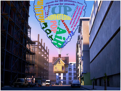 I was inspired by the Pixar movie Up for this assignment and the house that is carried by millions of balloons. I really enjoyed this project and how we needed to create a silhouette then fill it with words. I used quotes from Up and words that were associated with hot air balloons. I made sure to outline the balloon so that it was defined. I used different layers of text for each word. I wouldn't change a thing because I feel like it all worked. This is my favorite work that I have done.
A cRAzY CoMBo
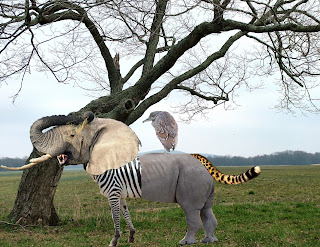 This is my Crazy Combo! I wanted to keep it very safari like and blend everything together so it fit and looked like it could be real in another world. I used the head of an elephant, teeth of a cheetah, front of a zebra, bottom of a rhinoceros, tail of a cheetah, and like most animals they have a little bird perched on them. I am really proud of this because I feel like I blended all of the parts really well. I was inspired by safari trips and how most of these animals live together in the circle of life. I am really proud of my crazy combo!
Thursday, February 10, 2011
15 Green Things That Are NOT Very Green
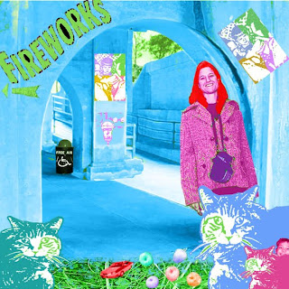 For this assignment we were given 15 green photos that needed to be photoshopped together. The green colors were allowed to be changed so there wasn't as much green when I was finished. I started this project probably four times before I was able to fully understand how it was supposed to be done. I had thought that EVERYTHING had to remain green. So when it was explained that we could change colors I have to say it became harder. I started over and over and finally started to like how it all was turning out. I tried to intermingle everything so it looked like it belonged there. I was inspired by streets and how grass sometimes blows onto pavement. All the graffiti and artwork that people put up on buildings makes cities what they are so I wanted to showcase that. I am satisfied with my work. I wish that I hadn't had to use all of the photos because some just didn't work together. For example the apples, grass, and random kid. This project was really fun to do though because the cats and other things were fun to warp. I really like the upper half of my photo. I think that it looks realistic. Second project...done! :D
Colorful Music
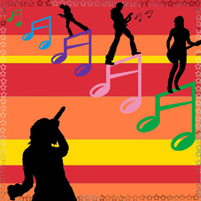
This project was to start learning the tools in photoshop and how to manage layers. I started to think about the meaning of music and what music does. Music brings people together and I wanted to show in this project the variety of notes and colors that comes when music is playing. I was inspired after my first try of this project to stray a little from the guidelines and experiment some more. I am satisfied with my work, but I wish that I could have incorporated more things into the picture. Next time I will make the tye-dye and graffiti have a bigger part in the photo. This was a fun project to get started in the world of photoshop.
Subscribe to:
Posts (Atom)


